31 August 2014

Artist Around the World Blog Hop

I can't thank my fellow artist Antoana Oreški enough for all the pushes and coverage she's been giving me. Not letting me fall asleep. She even gave me the privilege to join into the AATW Blog Hop, awakening my blog from a 6 months sleep. Thank you Antoana!

Antoana Oreški

Antoana is a freelance illustrator currently residing in Croatia. Yes, we do live in the same country, a 3 hours drive away from each other, yet met through MATS Bootcamp created by the amazing Lilla Rogers. I could continue my intro about Antoana describing her fabulous talent, but will not. Not meaning she lacks talent, just meaning she has so much more to offer. I'm not even going to post an excerpt of her CV, to read that simply go to her website. I'll try to put down into words what's I see in her art. Firstly, Antoana has the power to create and share warmth and beauty in everything she does. Her characters spread true innocence and playfulness into the world recreating childhood memories we all want to live in forever. The two of us share the same passion for creating and developing characters, hers being upgraded with breathtaking textures and details. I'm a true minimalist deep inside, but Antoana bought me with her intricate details. Let me show you just a small outtake of her huge eye candy portfolio. Enjoy it!


Antoana has a remarkable learning curve as well. In her modesty she will call herself a pattern rookie, just starting to evolve. But, hey, if these patterns are only her starting to grow, we'll better fasten our seat belts and get ready for a pure joyride in her new creations.


I must say, I've gotten pretty fond of this Lady and her secret corner filled with adorable creatures. To see more of her recent art visit her facebook page and blog. Warning: huge addiction factor involved. Beauty overload!


According to the AATW Blog Hop structure, here are some questions for me to be answered.

1.WHAT ARE YOU WRITING/WORKING ON?

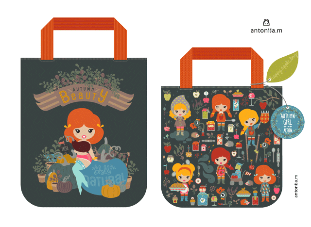
The last few months I've been working on my first trade show, the Brand Licensing Europe Show to be held 7-9 October in London. Not only boosting my portfolio with new art, reworking old pieces, yet thinking of all the little details that go into making a show debut: booth design, promotional materials, press contact, product design, paper work, etc. Most of my time and energy went into creating and developing a brand for my signature ladies (brand name, brand message, brand signals, collections, etc.) I will launch this week. Why did I create a brand for my little girls? It has much to do with my background in the branding world, as well with the show I've chosen to exhibit at. Brand Licensing Europe is a more character and brand oriented show and in the last year I've gotten great feedback on those girls of mine. Creating a brand and world just for them, I had to take them out of my Antonija M. licensing portfolio, meaning I had to create new characters and patterns to substitute that whole in my portfolio (and a mighty whole that was). MATS Bootcamp running from January to August came in just handy with its amazing briefs and assignments to fill my portfolio up. The same goes for a wide range of competitions I've been taking part in (GTS, Fabric8, Tigerprint, etc.) and the MIID summer school. I'm a very competitive spirit, but this time around it was really more for my portfolio than for the grand prizes.


2.HOW DOES YOUR WORK DIFFER FROM OTHERS IN YOUR GENRE?

I have this style of mine I call Sophisticated Cute. Japan meets Sweden. I was thinking a lot about this question when analyzing my own art trying to specify its place in the market. That's something I do on a daily basis when evaluating clients' brands and solving their communication problems. Maybe, that's also a factor that sets my design apart, I can't help it, yet to think of the products I can see my designs on. Actually, I don't even see myself as an artist, not even as an illustrator, more of a visual storyteller (that's what branding is all about as well). I love to tell stories, send out good messages and vibes. That's why characters always pop up in my work, I suppose. Oh, btw., I believe minimalism is one of my key features as well. You'll rarely find textures in it. I've been trying really hard to incorporate elements like that into my work, but it always felt wrong. It's a huge trend right now, supported by the technology on hand (talking about digital artists), but so not me. You have no idea how many times I've drooled over my fellow artists' work creating in such a lush manner. Hand drawn, hand painted, vector textured. I would get seduced into trying out those techniques, which would end fairly good in its execution since I'm a trained designer, but loosing the charm of its original. For that's the key to being different. Be original, even if it means just to be myself. So I decided to do it my way. Where that way is going to lead me is till to be seen. The only thing I know for sure, I'm already having a lot of fun along the way.


3.WHY DO YOU CREATE?

What kind of a question is that? I create for I have this crazy head of mine filled with pictures, characters, magical worlds, smart words, and they all want to get out. Right here, right now. I've been channeling this flow for a long time into creating and developing brands for clients, taming them to fit a campaign's message. With time they got wilder and wilder, harder to be put in line. One day I realized that maybe it wouldn't be such a bad thing to let them be the way they are. That's how I started to create under the Antonija M. brand, letting all those creatures and stories to run freely out, into the world.


4.HOW DOES YOUR CREATIVE PROCESS WORK?

Everything starts with a concept. A rough idea. This can be triggered by a brief, assignment or something I saw or heard. It can be line from a song I've been listening to or a book I've been reading. Or the inspiration can be more practical - I couldn't find something in the shops I was looking for, so what else is there to be done by a creative person, then to create it. I always carry my sketchbook and a pen with me. I can't tell you how that habit change my perspective on waiting in line. I have no problems with it anymore (it was a huge issue for me being an impatient person as I am), for as soon as I sit down to wait, I take out my sketchbook and wander off. The sketchbook is some kind of a idea catcher for me. Sometimes it doesn't even start with a drawing, only with words. An internal brainstorming put down on paper. From there, characters and other graphical elements evolve. Those pages hardly can be of any use to anybody than me. Multilayered and chaotic. They are my goldmine of ideas. Sometimes the pages get filled with more structured drawings, but sometimes they remain just that - my ramblings on paper. Usually I scan those more graphical pages into my computer and use them as a base for my designs. I'm well trained in PhotoShop, but almost never use it in my art. I'm a vector girl. I like the clean aesthetics of it. All ideas and concepts are fixed in my notebook and mind before I start working at the computer. I never ever sat in front of it without having a clear idea set. Even when working as a Creative Director I ask of my colleagues to show me their thoughts in sketches before getting any approval from me to proceed the idea digitally. Why? Because you'll miss the opportunity to get inspired by yourself - I scribble you made on paper can trigger an idea and take you somewhere you've never imagined. That hardly ever happens at the computer. The digital softwares often seduce us with their endless possibilities, jumping immediately into execution, not thinking through the concept or idea. That's how beautiful work without substance (not to call it soul) is created. Oh, I sidetracked. Let's get back to my work process. As said, I use my sketches as a background layer in Illustrator, redrawing them, tweaking and adding details, working as a stylist to make them fit my taste. I know, this doesn't sound very artistic, no paint, no canvas, no mess (except the one in my head) included. Of course, while creating digitally the design very often goes its own way, straying away from the sketch. Sometimes a new, even better idea pops up or out of it. As structured as my creative process may look, I often get surprised by what I end up. One recent example of this would be my GTS submission.


Enough has been said about me. Let me introduce two artists I admire greatly. Jill Howarth and Miriam Bos. I met both through the Make Art That Sells classes last year. Entering Lilla's school was like entering a candy store. There were so many great artists taking part that I had to pinch myself from time to time just to make sure it's for real, me working alongside such talented people. Please, don't think of this as an soap opera line it kind of sounds like (the ones accompanied with fake kisses). I'm not an art critic, I can only make comments through my heart and soul, staying as true as possibly to what I see and feel. Jill's and Miriam's work always made me smile. I would often say: Wow, why didn't I think of something like that (no envy included, only huge admiration).


Jill Howarth

As said before. I met Jill through MATS classes and she was my GTS semifinalist buddy last year. She's an artist I can often relate to, having a similar corporate background. Jill worked as a Senior Designer and Art Director for Hasbro. No wonder she creates the cutest contemporary children characters in the world. She herself summed it up perfectly with her blog's title Shamelessly Cute. Don't let her fool you with her cuteness, for she has an amazing brain and down to earth comments I love reading. They always made me fill less odd in this artistic world. We also share our love for vector art and our mighty mouses, paint and wall art being our mutual nemesis. This intro about Jill's creations is just a scratch on the surface. You've got to take a look at her lettering. She's an absolute master. The King and Queen of it. I'm not exaggerating, in no way! Take a look for yourself! I believe my words won't do justice to her work, so let her work speak:


Follow her most recent creations through her FB page. Jill and 5 other artists I admire a lot created the Happy Happy Art Collective spreading their joy. Do beauty and brains go together? Oh, yes they do, take a look at their blog.


Miriam Bos

Is one of the most hilarious persons I know. This personal feature reflects in her art as well. Her art is bursting with joy and colors. It's hard to list all things she accomplished so far, successful spoonflower shop, Fabric8 finalist, etc. I even had to share featuring her on this AATW blog hop with the talanted Sabine Reinhart - that says it all, what a hot commodity Miriam is. So many links you could and should follow her work: web, web, FB, blog. Isn't she a superstar?! I almost forgot, she exhibited at Surtex this year with her fellow artists from the Forrest Foundry Art Collective. It was a journey I followed on a daily basis eagerly awaiting what's next to come. Each post she makes, makes my day brighter. The world is in desperate need for more persons and artists like this. Let her colors and creativity jade you:


06 February 2014

Beauty sleep


I overslept 2 whole months. Don't know how that happened. I suppose, nobody ever knows. It just happens. Have to stay awake, for I have so many plans and dreams ahead of me in 2014, I better don't lose any time. This time around I'm not going to make any commitments, as it turned out they didn't impress me at all. It took Lilla Rogers' Bootcamp to start to shake me awake. It seems, prearranged milestones are a good thing to keep me from falling asleep. One of them is surely going to be the fact that I signed the contract for my BLE booth. Yes, it's in October, but time flies. I better make sure to show up on time and ready.

24 November 2013

Brand Licensing Europe or Surtex?


This blog post has been long due. Well, let's say a month. I'll keep to the old saying: better late than never. Anyhow, let's start. By the time part A of the MATS course (Make Art that Sells taught by Lilla Rogers) had finished I was sure that my style can have a future in the licensing market. I also got some additional validation of my work by making it to the GTS semifinals (Global Talent Search by the Lilla Rogers Studio). All that was fine, but I knew I had to make a good plan to enter the market. The most obvious step, at least to me, was to exhibit at a show (of course after building a respectable portfolio and bringing it online to life). There are two major international shows for the licensing market: Surtex – held annualy in May in New York, and Brand Licensing Europe – held annualy in October in London. Of course, there's also the sister fair of BLE (Brand Licensing Europe) in the States, the Licensing Expo held in Las Vegas mid June. I was aiming at BLE because its target is Europe as oposed to Surtex which is more USA market oriented. For the record, I walked Surtex last year while acctually visiting NSS (National Stationary Show) that's held at the same time at the Javits Convention Center. So I've got some insight into its look and feel. There are quite a lot of blog post about Surtex to be found. Artist who exhibited at Surtex telling their experience about building the booth, preparing promotional materials and handeling potential clients. Giving an insight into what they expected and how it all really played out for them. Not much info is to be found about BLE. So I decided to walk the show and check it out.

WARNING: This is a lengthy post containing lots of words, almost no images!!!


BLE2013 was held in the exhibition and conference center Olympia in London from the 15th to the 17th October. The show's fact sheet will tell you that they attract visitors from 69 countries, 9.537 total attendances, from which 7.244 being retailers, licensees, manufacturers and sales promotion professionals. Nearly 300 exhibitors are divided into 3 sections: Art & Design, Brands, Character & Entertainment. The concept of Art & Design is close to Surtex hosting freelance illustrators, pattern and surface designers, art agencies and independet design brands (Bell and Boo, Fatina dreams, Barbadango, etc.). The booth presentation and overall look is also aligned with what I saw at Surtex the year before. Everybody is friendly and open, willing to share their experience from past years. I contacted some of them prior to the show just to see if it's o.k. to stop by to introduce myself and ask some questions, keeping in mind that they aren't engaged in a conversation with a buyer at the time. We are all there for business. And first things first. I met Kate Knight, a wonderful lady and artist. She's doing BLE as well as Surtex. With these two shows she covers the European and the USA market. The same goes for Helz Cuppleditch a few booths down the aisle from Kate. It was a real pleasure to see her in action at her booth, making some new sketches for her gorgeous watercolor art. Me being more of a digital artist truly admire traditional art. I most certainly lack the patience for such immaculate execution. Uf, what would I do without the delete-erase-undo option. Not to talk about copy-paste. Helz also was the moderator at a very interesting panel held at the Licensing Academy Programme. I'll get back to that later in this post. Some exhibiting illustrators evolved their presence into brands. By that I mean, they are not presenting their name (the artist), rather the name of their products (the brands). How does that work? Instead of putting multiple alone standing images of cute bunnies and cats at the market, they come up with a story about the characters (not necessarily in the written form of a book, rather as a concept), give this story a name and thereby form a brand. One of the best examples at BLE, at least to me, is the Bell and Boo brand. Some additional highlights would be: Petite Frite, Barbadango and Fatina dreams. One artist/studio can have more than one story/brand. That's what differentiates BLE the most from Surtex. It's more brand oriented. Which makes sense since the major part of BLE is occupied by the big players of the industry at the Character & Entertainment section. Surtex interlaces with the National Stationary Show and therefore is more surface design oriented, while BLE has a more brand and character design base.


As soon as you enter the Olympia Center at the time of BLE you are visually bombarded by all the major international characters. Hello Kitty, Disney Princesses, Chuggington, Angry Birds, Spongebob, Ben 10, the Winx, etc. You name it, I saw it. That's the epicenter of BLE. All the big players in one place. Disney, Nickelodeon, Sanrio, 20th Century Fox, Turner enterprises, Mattel, Rovio, just to name a few. One, as a future exhibitor, could easily get intimidated by all these names and of course the numbers playing around them. But trust me, they are all after the same thing, the next hit. All the brands are consumer goods, and they get consumed, and the audience is always asking for something new and exciting. That's why there's always place for new ideas, stories and characters. Do you know which are the 4 top licensing brands in the last decade for the girl market? Barbie, Disney Princesses, Minnie Mouse and Hello Kitty. Those 4 brands are the best selling brands, and yes, licensees are eagerly looking for the next big thing to make their products sell faster. So far none of the other brands came even close to the top 4. The primary thing being – what makes your brand/art different and relevant to the consumer? Each month new generic brands and characters are brought to the market, who basicly all look alike, in character development and story wise. Big eyes, thin waiste and long legs. There you have the proof. Not much changed since Barbie was brought to life. Another Mattel example. As soon Mattel saw that its selling numbers of the Monster High brand was declining they came up with a new brand Ever After High, featuring the same look and feel, just repacked into a new story. 'New' being the magical word in marketing and sales. By now you may think, o.k. what do I have to do with these giants? I'm out of their league. Basically not. It's all about storytelling. The only difference is, they have a mighty communication channel – animation production, media coverage, distribution channels and of course endless financial resourses, while mine are limited to call it mildly. That's why this section of BLE is called Characters & Entertainment – those are brands emerging from the entertainment industry (movies, animated series & co). Yet, nothing is impossible. Just think of two brands: Angry Birds and the Moshi Monsters. These two fast growing brands are coming from a completely different industry – from the gaming industry. Times are changing. Angry Birds were created by Rovio an online game developer. And believe me, it wasn't a fast success for them. Prior to Angry Birds they created 53 games nobody has ever heard of, at least if you're not an online game addict. Their 54th game, the Angry Bird became an instant hit. Rovio didn't make a grandious plan to shift from the online game market into entertainment business. It just happend. They created a game and kept evolving it along the same story, had some great characters in it, and the rest is history. The best thing is, we are not talking about decades, we're talking about 4 years. And Angry Birds is to be found on everything, from food packaging to clothing and beyond. So, everything is possible. The same goes for the Moshi Monsters. Another brand born in the online gaming world. Cute little monsters entering the entertainment market and conquering the licensing world. What's my point? The same rulles apply to the Art & Design section and the Entertainment section of BLE. You've got to know your market and create a plausible story and character they can emotionally get attached to. Just to make one thing clear, I'm surely not going to exhibit at the Entertainment section should I decide to show up next year as an exhibitor at BLE. But, there's always a possibility to get the attention of a production company that could help you evolve your story and characters. You don't have to do everything on your own. At BLE you can meet companies who have the channels to get your story to a broader audience, while Surtex brings you direct exposure to the Stationary industry – paper and gift market. I'm not talking about the attendees, rather the industries exhibiting at the same place who support each other (not altruism, sheer business intelligence).


Let's hop over to the third section: Brands. At first I didn't understand what this section was all about. You'll find the Arsenal Foodbal Club there, as well as the British Museum, Playboy, NBA Europe, FIFA, Chupa Chups, etc. Well known and established international brands. But none of them coming from the entertainment world. You'll find a lots of sports brands here, but they don't see themselves as entertainment. They don't even want to be perceived as entertainment, rather as institutions. The tradition is what matters to them, what they feel makes their brands strong and powerfull. That's the opposite from the Character and Entertainment industry – disposable and fast changing environment. It's a whole different world. This is an additonal proof to there's place for everyone, but you've got to have your story straight, you've got to know whom you're talking to and where you want to go. These questions all come up at the time when you have to decide which show to exhibit at and in whitch section of it.

From what I saw at Surtex, the art presented addresses a variety of target markets – be it gender, age or industry; from kids to adults, male and female, and all different kinds of industries (paper, apparel, gift, home decor, wall decor, etc.). The BLE exhibitors are mostly targeting the children (baby, teen, tween) and young adults market, characters being their selling point. The children market is the most fruitfull part of the licensing world. There are many statistics supporting this statement. 3 out of 4 buyers chose products displaying licensed images (well known characters of course) when buying presents for kids. Can you even imagine how many presents a parent has to buy anually for all the kids his kid is invited to. It's huge. How do I know this? By attending the BLE Licensing Academy Programme. It's open to all exhibitors and attendees and packed with lot of interesting topics and info. I could write a blog post just about all the stuff I learnt there and most probably will. I have to get back to the panel Helz Cuppleditch held hosting the amazing brand Bell and Boo. And then, there's the License! This competition. All together it were 3 amazing days at BLE. It's not so much about who or what I saw or whom I talked to. It's about how I went home with a competely new perspective at the licensing business and where I see my work in it. All in a good way of course. After all, we're talking about London, and only good things can come out of there. Btw. I decided to exhibit at BLE next year in October. Leaves me enough time to get my portfolio and brands straight and all the pre-show promotion in time. And now I have the perfect excuse to come back to London.

Note: the shows' review has been put together only according to my own impressions and knowledge. It has no scientific back-up. It can easily be that another person at the same time would have come to another, maybe even opposite conclusion, to mine.

28 October 2013

Sweet Christmas

Time flies by too fast. I have so much to write about, so many thoughts wanting to be presented to the world. Yet, time is not on my side. Maybe it's all about getting more organized, not wasting time on trivial things, or maybe I should stop overthinking topics and put them down on paper (or screen, to be more precise). I'll start with this post. I'll keep it simple. Here are a few christmas designs I finished today. Lettering meets illustrations. The topic was to create christmas type, but somehow along the way the story evolved and I made this series of three cards with christmas cookies, candies and cupcakes. I've chosen the word 'Noel' on purpose, for the wording to stays readable in the whole composition. 'Noel' was transformed into cookies, mistletoe and cupcakes accompanied with christmas decorations and little birdies (I couldn't resist adding some characters into the story). The idea to use cakes and cookies as a central piece came after brainstorming for new recognizable christmas icons. There are so many great takes of christmas cards on the market already, so it takes something new to create interesting sellable art.


The color scheme is kept within a limited color quantity, reinterpreting the classic red-green christmas colors. As you can see there is no 100% white in the images. That's how you can achieve a more vintage style (as well as not to use 100% black or rich black). The red gives enough freshness, poping and contrast. Little note: exporting the images into png files diminishes the intensity of the reds - in the source file it's even brighter. And of course, no use of structures makes it obvious to be digital art. I was really tempted to age it even more by adding rubber scratches and brushes in Illustrator, but decided to stay true to my style. It already had enough details with all the yellow thread making its way through the whole design.


As promissed, I'll keep it short this time. I'm already working on the next posts. I still haven't posted about my trip to London and me walking the Brand Licensing Europe show (that's going to be a lengthy one). And MATS! We already entered week 4 and I haven't written a word about it, haven't shown one single image. Well, let's get down to work! In a few months none of it will be newsworthy anymore.

10 October 2013

Going Waco : Winter Wonderland

Still playing around with my Wacom tablet. Trying to find the best way to use it, yet stay true to myself. My style actually. So far I explored different possibilities in Illustrator and Photoshop. The options are really vast. I never even knew that there were so many brushes on the market. That's the thing with technology, it easily seduces you, sometimes into ways you never imagined, sometimes into ways you never wanted to go. While trying to get used to this new tool I'm also watching out not to end up in the wrong alley. I can't tell you how much fun I had playing with all the options, but at the end I always came to the same conclusion - that's just not me. So I started a new strategy. I took my existing style and pushed it through Wacom post production (o.k. I just made up this term so don't start googling it) to get an upgraded version of the same image. I wasn't going for shades to gain 3D (for that I could have used a 3D modeling program), I was more looking to give it more atmosphere. That's how Winter Glamour Girl was created.


As you can see I took an existing character design of mine and started adding some new layers. And a little bunny. Couldn't resist. Initially there was supposed to be a feather, but it already looked too furry.


Here you can see the stages of adding layers to the initial show girl. Everything was done in Illustrator. Quite simple. I only used 2 brushes and the transparency option. And the Wacom stylus, of course. This is definitely a look I wouldn't have achieved with my truest companion the Mouse. A mouse just doesn't take you to places like this. When I hold a mouse in my hand my mind works in a different way. More calculated, less flowing. And you can't swipe the mouse like a stylus to achieve that kind of energized lines. To keep it short, I like the outcome. Winter Wonderland.


30 September 2013

Listen to advice given : post GTS activities


It's been a while now since the GTS finalist were announced and with it the jury's review of the finalists' work as well as some tips for the one who didn't make it to the next round. Me included in the later group, although I see the semifinals as a huge success for my work (being in top 50 out of 1500 submission – not bad, not bad at all). Anyway, all this time my mind has been going back to the jury's comments. The problem was that I really liked and still like my submission to the semifinals and wasn't immediately receptive to the advice offered. Check the jury's comments and the finalists' work out on Lilla's blog.

I know that wise people listen to wise people. And the GTS jury is certanly a bunch of highly knowledgable people from the licensing market. The market I'm aiming at. Am I going to be a fool to reject that kind of input? Shouldn't I be smart enough to listen to an insider tip? Well, I consider myself to be a bright lady, so I decided to go for it. Let's do another work listening to the jury's advice. I'm doing it just for myself. To learn something, to grow. You know how often we nod with our head in sign of understanding when somebody offers us an advice or know-how? The advice easily gets lost if not used. It all sinks in at the moment when we start using the advice. That's why I decided to do it. To let the knowledge get stuck on me.

One thing I made clear to myself imediately – it's not going to be a redesign of the existing design, it has to be a new concept yet true to my own style. It's not about being a copycat. It's about building the tips into my style and creating a more market oriented product.

Let's start. The assignment was to create a Farmer's Market Autumn Tote Bag. I'll be going through the jury's tips not in the order given, but in the order relevant to the process of creating the concept and design for the tote.  A short note: I changed from apples to pumpkins and kept a similar color code to my old tote.

1.     Try to make your work stand out from what is in the market already. Truly challenge yourself to be unique in style.
2.     Rember your audience's age. What style would most appeal toyour clients's cutomer? I would add, always keep the target market in mind.
3.     Think about the overall composition. Totes are meant to be fun and simple.

Here's what I did: I upgraded my little ladies, better said, one of them grew up quickly into a sexy farmer's daughter. Obviously inspired by the vintage pin-up girls. I added the sexy factor for the more grown-up population, taking the design above the teenager audience, yet staying true to my style and being cute. Btw. she has a top on, but the purple pumpkin was placed on purpse this way to leave different kind of interpretations open.


4.     Simplify. Don't make it too busy for something like a tote bag. This particular assignment naturally called for a strong central image. It's more than obvious that I missed the brief completely with my old design. Too much going on without a centrale image. O.k. I corrected that in this new design.  The farmer's daughter is the focal point of my design, while everything else builds around her creating a coherent composition.
5.     Get words involved; they're the secret weapon of great illustration. In the new design I concentrated much more at the hand lettering (in my own way of course). I used ambiguous wording – Autumn Beauty, refering to the girl as well to the fruits of Autumn. The inscription on the blue pumpkin can also be read as the pumpkins being all natural as well as the farmer's daughter. Plastic surgery free.
6.     Put a LOT of effort in it. I did, taking care of each detail, pumpkin, tattoo,...


7.     Create a picture that shows a little 'narrative nano-second' – a moment that has sense of timing. It's better than a scene that is just standing still. That's why I created the mouse and cat scene. I put the action into the background not to override my focal point. Initially there were also some snails involved on the blue pumpking, but I left them out not to make it too bussy – see topic 4.


8.     Use your imagination to create a unique way of showing an idea or telling a story. I think I covered this topic by using my pin-up farmer's daughter.

I didn't use any structures on the surfaces, I know it's trendy right now, but it just isn't me. I like simple, yet clever and effective things. Contemporary and clean design with a strong storytelling component.

At the end, I must admit that I really really like the new design. It does work better on a tote.


What do you think? Let me know.

Going through my GTS round 2 files I also discovered these two totes I created after submitting my design with the pattern. I obviously also felt the urge to put less on it. I just extracted 2 characters and let them on their own.


26 September 2013

Going Semi-Waco

Another hand writing exercise. This one I did with a mouse and a stylus. I've been told many times 'once your get hold of a drawing tablet you will never go back to a mouse'. For now I just can't let go of my precious mouse. Old habits do die hard. I like to construct objects/elements in a more concise way - less organic. This lettering poster is a good example of it. The characters shown are constructed, as well as the typography 'up little one'. The word 'wake' was traced with a mouse - my old way of doing things, while the caption at the end was drawn with a stylus. I didn't have a complete view of how it's going to end up, so I decided to take a stylus and go with the flow. Of course, post-tweaking included.


And a close up of the bottom caption. The idea was to write/draw the text in each line with one single continuous line. I could have done the whole sentence in one line, but a lot of readability would have been lost.


Btw. I like the message of the lettering. From time to time we all sometimes hide away from the rest of the world thinking we don't make a difference. That we haven't got anything special to offer. Well, open your eyes, open the door of you hiding place and discover that the World awaits you. That you can brighten up somebody's day just by being you. But you're the one who decides to wake up! You like dreams?! You can always daydream. Stay awake!

25 September 2013

Going Waco : Hello

I'm starting a post series under the title 'Going Waco'. It doesn't have much to do with the state of my mind rather with my Wacom tablet I bought this summer. Somehow I never found the time to try it out, not mentioning to start working with it. So far I've done all my work, illustrations and character design included, with a mouse. Well, it is Apple's Magic Mouse, but still not a magic wand. Maybe the mouse as my tool shaped my style. I don't know. We shall see. The Intuos5 has a pressure sensitive pen and can produce some really stunning features but for now I'm staying true to myself. All those structures and brushes just aren't my Ding (germ. thing). I like to keep it simple. It's my belief that if you have a good idea/concept you have no need for adding bells and whistles to your work unless asked for by the nature of the project or the message you're transmitting. This isn't an universal thought, it's just how I see it. Let's say Hello to my new series.


I did a rough sketch of the lettering in my notebook, scanned it into the computer and traced it with a stylus pen in Illustrator. Of course it didn' come out immediately like this. That's the good thing about vector art you can easily tweak it. Here are some additional ideas that evolved from the above hand lettering.

20 September 2013

1 ON 1

While thinking about what labels to use for the content of this blog, which actually means that I'm thinking about what to put on this blog, I decided to give myself a timeframe for posting. I made a 1ON1 commitment to myself - 1 post each week. My loyal companion through life is rolling his eyes as I'm writing down these words. He knows me too good and he's sure there's no way I'll be able to hold on to this commitment. Well, I'm going to challenge myself. I say - 1 on 1 it shall be!

A little hand-lettering exercise. 

18 September 2013

1st Blog Post ever

Here it is! My 1st blog post ever. This has been on my to-do-list for a long time now. I've been postponing it beyond every deadline. I don't know why I've been dreading it so much. Lately I've been doing a lot of first timers, so why not do a blog? The 1st post is a good time to reveal what this blog is going to be about. Well, ... I don't know exactly. I'll think of something along the way. For now a brief hello!


P.S. I made a promisse to myself, as well as to you, to post regularly. Please remind me of this caption in case I should get lost for weeks or months. I will use this blog of mine as an exercise for staying focused and disciplined. Much needed skills!